
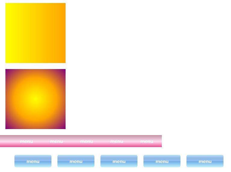
그라디언트는 두가지 이상의 색상을 서서히 변형되게 만들어 주는 역할을 한다.
여기에는 방향과 색상을 표현하는 속성이 적용된다.
선형 그라디언트 적용 예 :
background-image: linear-gradient(direction, color-stop1, color-stop2, ...);
background-image: linear-gradient(angle, color-stop1, color-stop2);
- 방향을 right처럼 정해주거나 45deg처럼 각도를 넣는 방법이 있다.
원형 그라디언트 적용예 :
background-image: radial-gradient(shape size at position, start-color, ..., last-color);
예를 들어 아래와 같이 색상의 범위를 지정해 줘도 된다.
background-image: radial-gradient(red 5%, yellow 15%, green 60%);
| 속성명 | 속성값 | 설명 |
| linear-gradient | 방향, 컬러1, 컬러2... | to right처럼 방향, 두가지 이상의 색상 적용 |
| radial-gradient | 컬러1, 컬러2, 컬러3... | 여러 단계의 색상 적용 |
| css generator 사용 | 벤더프리픽스 사용 예시 | 아래 generator사이트 소개 |
| 가상요소에 배경넣기 ::after | 가상요소에도 배경 적용가능. | 단, display:block으로 처리 |
See the Pen PoqQZbd by LimsUIUX (@LimsUIUX) on CodePen.
<!DOCTYPE html>
<html lang="en">
<head>
<meta charset="UTF-8">
<title>background관련속성-2</title>
<style>
body{height: 3000px;}
.box1{
width:200px;
height:200px;
background: #f19d9d;
background: linear-gradient(to right, yellow, orange);
margin:20px;
}
.box2{
width:200px;
height:200px;
background: #f19d9d;
background: radial-gradient(yellow, orange, purple);
margin:20px;
}
.box3 ul{
width:500px;
height:40px;
background: #c491a3; /* Old browsers */
background: -moz-linear-gradient(top, #c491a3 0%, #ffddf1 54%, #ea4d8e 100%);
background: -webkit-linear-gradient(top, #c491a3 0%,#ffddf1 54%,#ea4d8e 100%);
background: linear-gradient(to bottom, #c491a3 0%,#ffddf1 54%,#ea4d8e 100%);
}
.box3 li{
float: left;
color:#fff;
font-weight:bold;
list-style:none;
width:100px;
height:40px;
line-height: 40px;
text-align: center;
}
.box4 ul{list-style:none;}
.box4 li{
padding:10px 40px;
border-radius:5px;
float:left;
margin:10px;
color:#fff;
font-weight: bold;
background: #b8e1fc; /* Old browsers */
background: -moz-linear-gradient(top, #b8e1fc 0%, #a9d2f3 10%, #90bae4 25%, #90bcea 37%, #90bff0 50%, #6ba8e5 51%, #a2daf5 83%, #bdf3fd 100%);
background: -webkit-linear-gradient(top, #b8e1fc 0%,#a9d2f3 10%,#90bae4 25%,#90bcea 37%,#90bff0 50%,#6ba8e5 51%,#a2daf5 83%,#bdf3fd 100%);
background: linear-gradient(to bottom, #b8e1fc 0%,#a9d2f3 10%,#90bae4 25%,#90bcea 37%,#90bff0 50%,#6ba8e5 51%,#a2daf5 83%,#bdf3fd 100%);
}
.box4::after{
clear:both;
display:block;
content:'';
}
.box5{
width:500px;
height: 500px;
border:20px dotted #333;
margin:50px;
padding:25px;
background-image: url('img/img1a.gif'), url('img/img2a.gif');
background-repeat: no-repeat;
background-size: 300px, 50px;
/* background-position: right center, bottom;
background-attachment: fixed, scroll; */
background-origin: content-box;/*border-box | padding-box | content-box*/
}
p{
width:600px;
padding-left:50px;
}
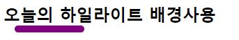
h2::after{
width:100px;
height:10px;
position: absolute;
left:1.0em;
background: purple;
border-radius:1.0em;
content:'';
display:block;
clear:both;
}
</style>
</head>
<body>
<h1>배경에 그라디언트 활용, 밑줄장식tip</h1>
<ul>
<li>linear-gradient(방향, 컬러1, 컬러2...)</li>
<li>radial-gradient(컬러1, 컬러2, 컬러3...)</li>
<li>css generator(벤더프리픽스 사용 예시)</li>
<li>가상요소에 배경넣기 ::after(가상요소에도 배경 적용가능. 단, display:block으로 처리)</li>
</ul>
<div class="box1"></div>
<div class="box2"></div>
<div class="box3">
<ul>
<li>menu</li>
<li>menu</li>
<li>menu</li>
<li>menu</li>
<li>menu</li>
</ul>
</div>
<div class="box4">
<ul>
<li>menu</li>
<li>menu</li>
<li>menu</li>
<li>menu</li>
<li>menu</li>
</ul>
</div>
<div class="box5">
What is Lorem Ipsum?
Lorem Ipsum is simply dummy text of the printing and typesetting industry. Lorem Ipsum has been the industry's standard dummy text ever since the 1500s, when an unknown printer took a galley of type and scrambled it to make a type specimen book. It has survived not only five centuries, but also the leap into electronic typesetting, remaining essentially unchanged. It was popularised in the 1960s with the release of Letraset sheets containing Lorem Ipsum passages, and more recently with desktop publishing software like Aldus PageMaker including versions of Lorem Ipsum.
</div>
<h2>오늘의 하일라이트 배경사용</h2>
<p>
What is Lorem Ipsum?
Lorem Ipsum is simply dummy text of the printing and typesetting industry. Lorem Ipsum has been the industry's standard dummy text ever since the 1500s, when an unknown printer took a galley of type and scrambled it to make a type specimen book. It has survived not only five centuries, but also the leap into electronic typesetting, remaining essentially unchanged. It was popularised in the 1960s with the release of Letraset sheets containing Lorem Ipsum passages, and more recently with desktop publishing software like Aldus PageMaker including versions of Lorem Ipsum.
</p>
<div id="box6"></div>
</body>
</html>
[림스Tip]
그라디언트 제너레이터를 사용할 수 있다.
제너레이터에서는 색상, 방향, 형태 등을 직접 조작해 주면 코드가 생성된다. 이것을 복사해서 코드에 넣어주는 방법도 가능하다.
CSS Gradient — Generator, Maker, and Background
As a free css gradient generator tool, this website lets you create a colorful gradient background for your website, blog, or social media profile.
cssgradient.io
-https://www.colorzilla.com/gradient-editor/
Ultimate CSS Gradient Generator from ColorZilla
A powerful Photoshop-like CSS gradient editor
www.colorzilla.com
'UIUX Web Standard > COA Lab's CSS' 카테고리의 다른 글
| background속성 4 - blend-mode (0) | 2021.01.25 |
|---|---|
| img에 filter 처리하는 방법 (0) | 2021.01.25 |
| background속성 2 - attachment (0) | 2021.01.25 |
| background 속성 1 - 기본 (0) | 2021.01.25 |
| display 속성 2, 가시속성 (0) | 2021.01.25 |


